Building a Dashboard
Building a Dashboard
In this step, we will create a basic dashboard using three different types of visuals.
- Click on the Visual KPI icon.
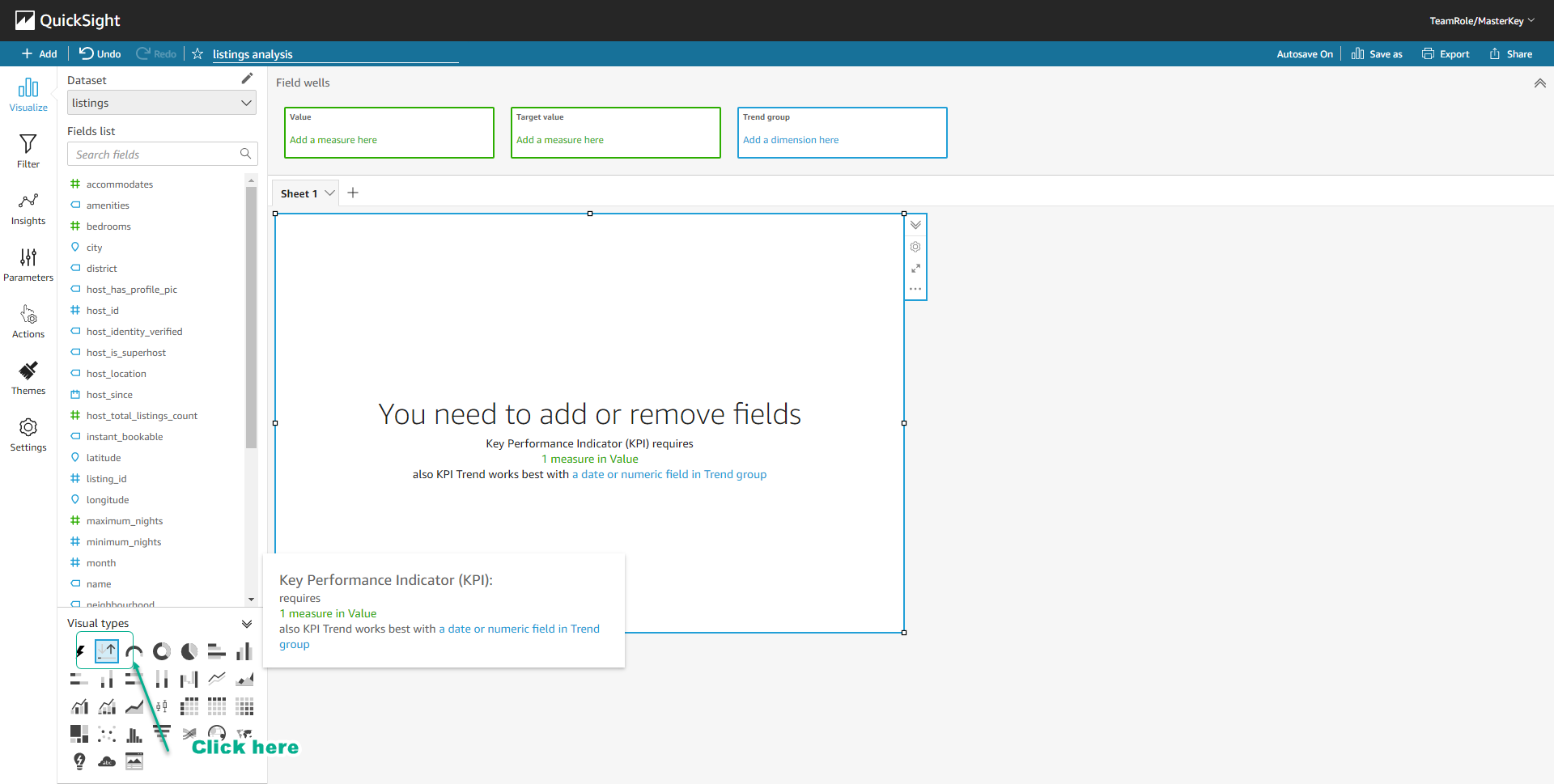
- Click on the field review_score_value in the Fields list.
- Select review_score_value in Field wells.
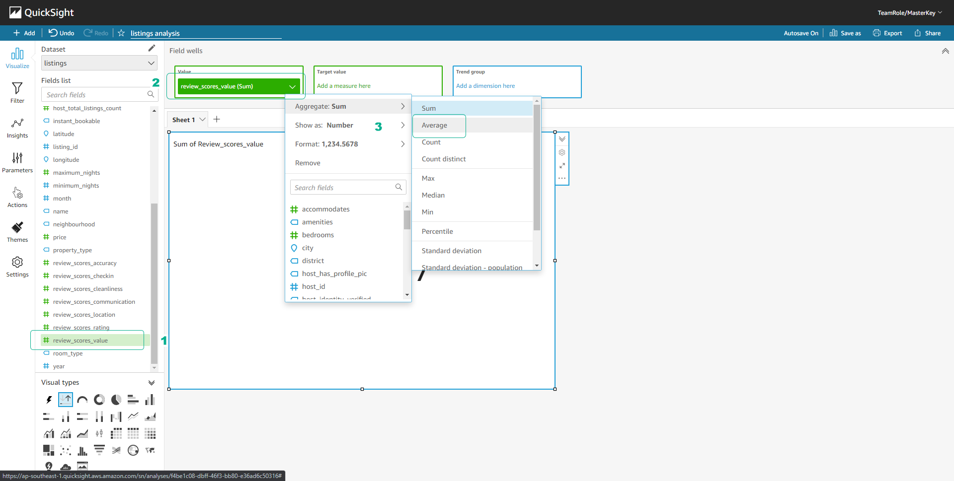
- Choose Aggregate, then select Average.
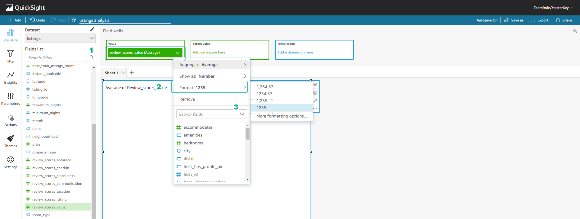
- Select review_score_value in Field wells.
- Choose Format, then select 1235.
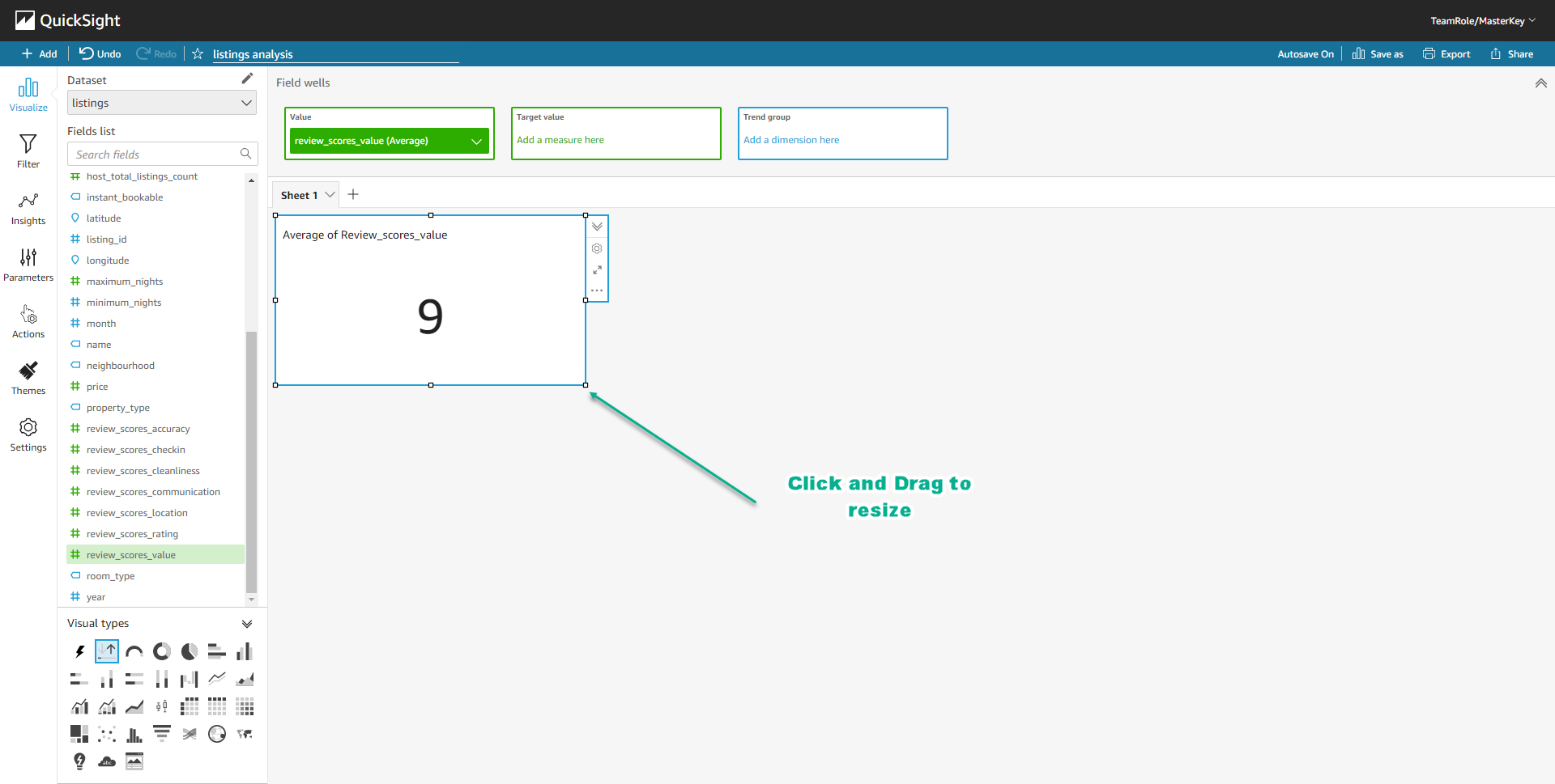
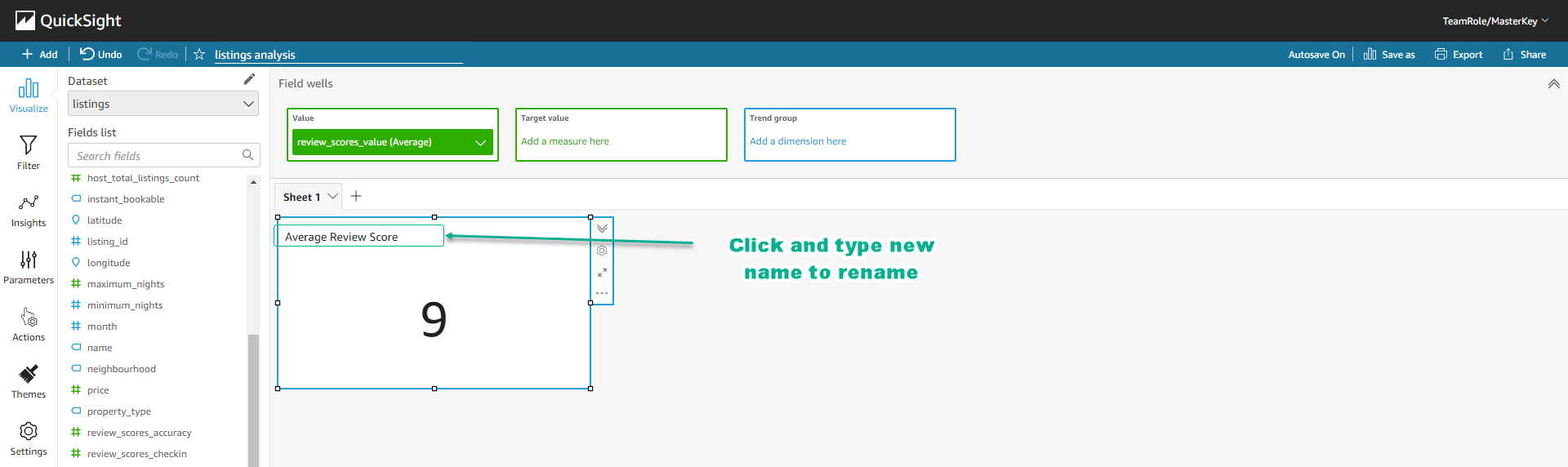
- Click on a point of the Visual border, we can resize the Visual by dragging.
- Click on the name of the Visual and rename it to Average Review Score.
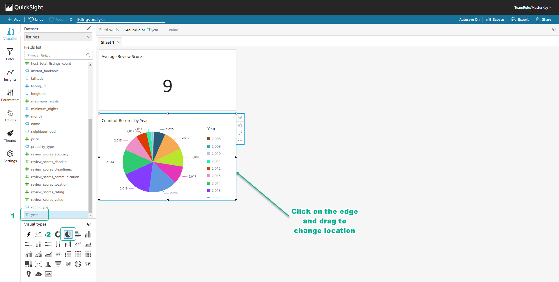
- Click on the field year in the Fields list.
- Click on the icon of the Pie chart visual.
- You will create a new Visual counting the number of Airbnb listings by year.
- You can click on the edge of the visual and drag to change its position.
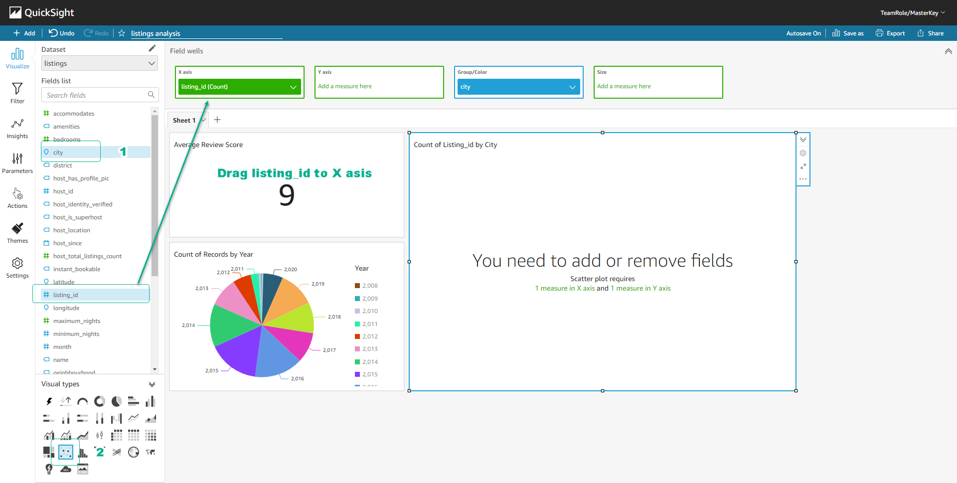
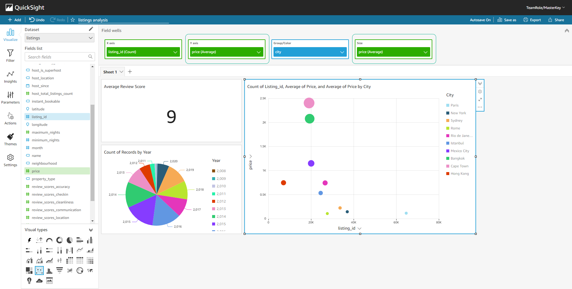
- Click on the field city in the Fields list.
- Click on the icon of the Scatter plot visual.
- Drag the field listing_id from the Fields list to the X axis in Field wells.
- Continue to drag the field price from the Fields list to the Y axis and Size in Field wells.
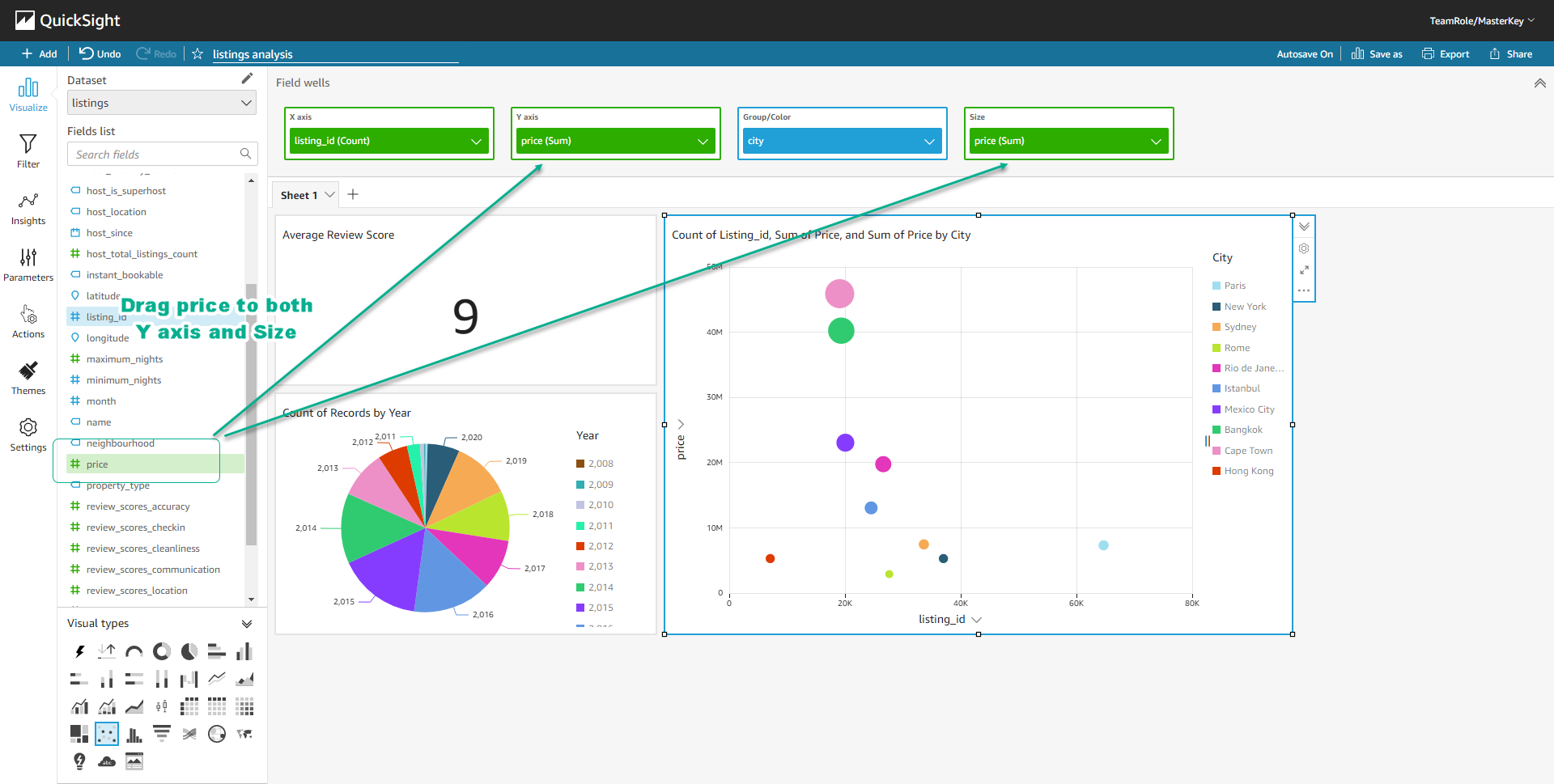
- We have created a Scatter Plot visual showing the number of listings and the average price per city.
Congratulations, you have completed the workshop on creating a data lake, setting up a workflow, and building a personal analysis dashboard. Don’t forget to clean up resources to avoid unexpected costs.